A collection of interface improvements makes routine work easier to scan and keeps navigation out of the way when it is not needed.
Read automations by trigger and outcome
The automation list gives Trigger its own column with a link to the event. Message counts use distinct icons for sent, delivered, failed, and pending results. Larger titles, aligned columns, and a subtle padded hover highlight make neighboring rows easier to follow.
Choose the campaign view
Campaigns support list and card views, so you can choose a compact overview or a more visual way to browse. The message, status, and landing-page context remain connected to the campaign.
Keep smaller screens usable
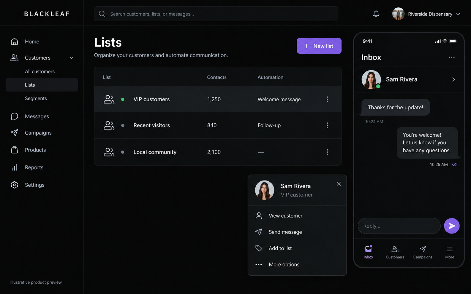
Navigation now switches consistently between desktop and mobile layouts. Inbox and campaign panels fit the available workspace, and the mobile campaign footer keeps its actions within reach while the content scrolls.
Remove unnecessary interruptions
The workspace rail hides when only one workspace remains. Account menus close when you select an item, click outside, scroll, or press Escape. Support opens in its panel from the account menu without replacing the page you were working on.