Platform, Navigation, and UI Improvements

Table of Contents

We updated the platform interface to make everyday work easier to find, understand, and complete.

Navigation is clearer, page headers follow a consistent structure, complex selections open in focused menus, and important customer and system information is easier to reach. The result is a platform that feels connected instead of a collection of separate tools.

Navigation organized around the work

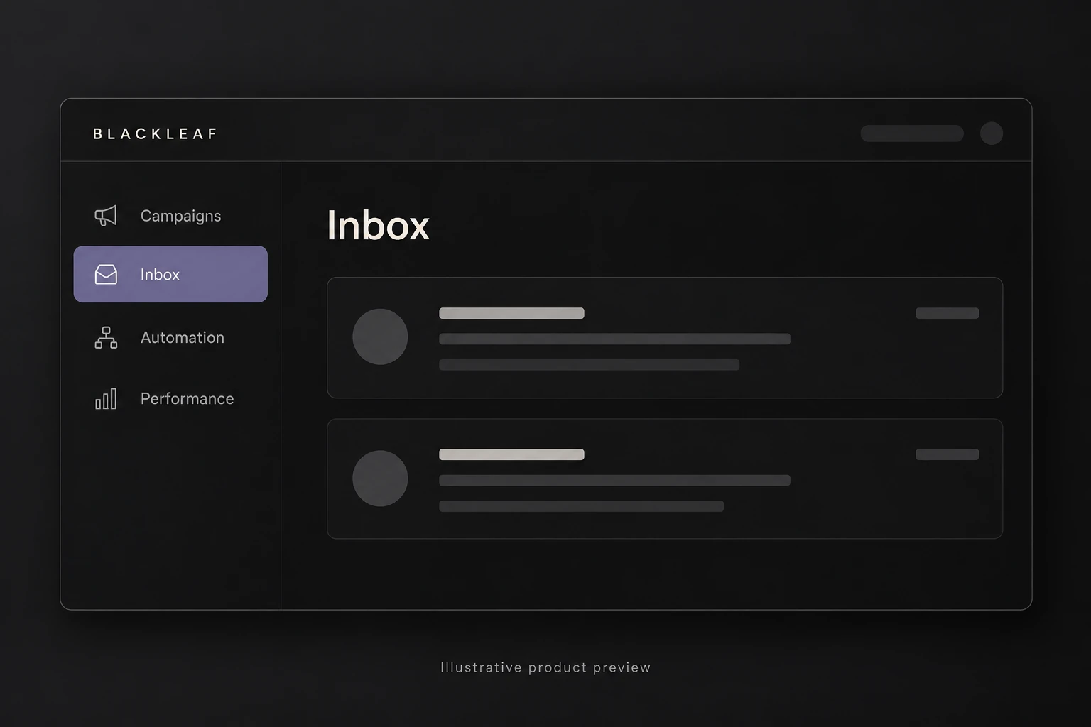
The main navigation now groups related tools by the job they help complete.

Campaigns, Inbox, Automation, Performance, customer data, content, and configuration are easier to scan without competing for attention. Active sections are clearly identified, while secondary tools remain available without crowding the primary workflow.

Consistent headers and page actions

Headers now establish the same hierarchy across major sections.

The page title, primary views, filters, refresh controls, and creation actions appear in predictable positions. This makes it easier to move between sections without relearning where the most common controls live.

Focused menus for complex choices

Selections that need context now open as styled HTML menus instead of relying on crowded native dropdowns.

Audience lists, sender profiles, date ranges, strategies, customer definitions, and other multi-part choices can show labels, descriptions, counts, recommendations, and status in one focused view. The selected value remains compact on the page while the detail appears only when it is needed.

Customer information is easier to inspect

Customer records now connect identity, subscription status, rewards, transactions, redemptions, and messaging history.

Contact details open above the list without removing the surrounding context. Search, filters, sorting, and subscription views make it easier to move from a broad customer segment to the activity of one person.

Tables that are easier to read

Lists and reporting tables now share clearer spacing, alignment, labels, and row behavior.

Column headers stay aligned with their values, numeric information is treated consistently, and secondary details remain visually connected to the item they describe. Empty states also replace incomplete table structures when no records are available.

Focused on performance, not noise

The dashboard now prioritizes information that explains what happened and what should improve next.

Instead of filling the page with disconnected daily totals, Performance starts with messaging volume, delivery, engagement, source, carrier, customer, and outcome signals for the selected period. Detailed views remain available through tabs, while the first screen provides a readable summary.

Account and system controls stay available

Operational controls remain accessible without dominating the main workspace.

Account selection, configuration, refresh actions, exports, and administrative tools are positioned around the work they affect. Teams can reach system controls when needed while keeping the primary interface focused on customers and messaging.

Why this matters

Interface consistency reduces the time it takes to understand a new screen and lowers the chance of an avoidable mistake.

These improvements make the platform easier to navigate, reduce visual noise, and keep important actions connected to the information they change. The experience is faster for routine work and clearer when a team needs to investigate something more complex.