A New Messaging Performance Dashboard

Table of Contents

We rebuilt Performance around the way text messaging actually works.

Campaigns, automated campaigns, inbound messages, two-way conversations, carrier delivery, clicks, and customer outcomes now come together in one reporting experience. Instead of reading disconnected daily totals, you can see how messaging performed during the period you care about and where the next improvement should come from.

One view for every kind of text

Performance is no longer limited to one-time campaigns.

The dashboard summarizes messaging from campaigns, automated campaigns, one-to-one conversations, and inbound customer activity. This creates a complete view of how much messaging occurred, where it came from, how much was delivered, and how customers responded.

Report on the period that matters

Choose Today, 7 days, 28 days, 3 months, or a custom date range.

Today helps teams monitor active messaging operations. Shorter ranges make it easier to investigate recent delivery or engagement changes. Longer periods reveal trends across campaigns, customer behavior, and carrier performance. Custom reporting supports a promotion, store event, launch, or any other defined business period.

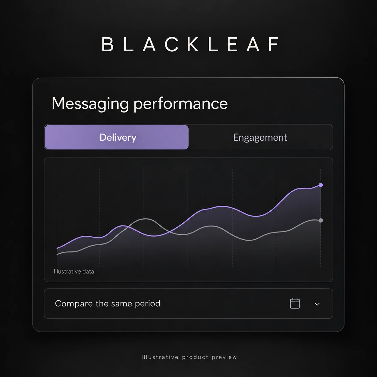
Messaging performance over time

See when messaging volume, delivery, engagement, and failures changed.

The chart separates activity, delivery, and engagement so large message totals do not flatten smaller but important customer signals. Use it to compare outbound and inbound activity, delivery and failure rates, and tracked engagement across the selected period.

Delivery health that explains the total

High-level delivery rates are only the beginning.

Messaging Health shows delivered, failed, and opted-out activity alongside provider states. Instead of an unexplained status code, each state is labeled and counted so teams can understand whether messages were delivered, accepted, paused, undelivered, or otherwise affected.

Carrier reporting based on messages actually sent

Carrier mix now reflects campaign traffic that was actually sent, not pending audience records.

See volume, delivered messages, failures, and delivery rates by carrier. This makes it easier to identify whether a performance change is broad or concentrated with AT&T, T-Mobile, Verizon, or another carrier before changing campaign content or increasing volume.

Campaigns and automations in one comparison

Automations are automated campaigns, so Performance reports on both together.

Compare audience, delivery, engagement, failures, and cost across one-time and automated campaigns. Open an individual program to inspect its messages, clicks, carrier details, failures, and customer-level activity without losing the larger reporting context.

See customers reached, not only messages sent

Message volume can hide how often the same customers are being contacted.

Performance now measures unique customers reached and messaging frequency. When purchase data is available, it can also show how many customers received a delivered text and later completed a purchase, including the observed purchases per 100 delivered contacts. Purchase reporting remains hidden when the required transaction data is unavailable.

Reporting designed to answer the next question

Every major metric now has a definition and a path to more detail.

Use the dashboard to answer practical questions: Did delivered reach improve? Which program created the volume? Are customers replying? Which carrier is failing? Are the same people being contacted too often? Did customers purchase after receiving a text?

The goal is not to add more charts. It is to make messaging performance understandable enough to act on.

Why this matters

Daily totals do not explain why a messaging program improved or declined.

A complete reporting system connects volume to delivery, delivery to engagement, engagement to customer behavior, and every result back to its campaign, automation, conversation, and carrier. Blackleaf Performance now gives teams that complete view in one place.